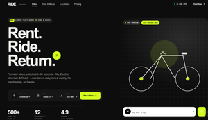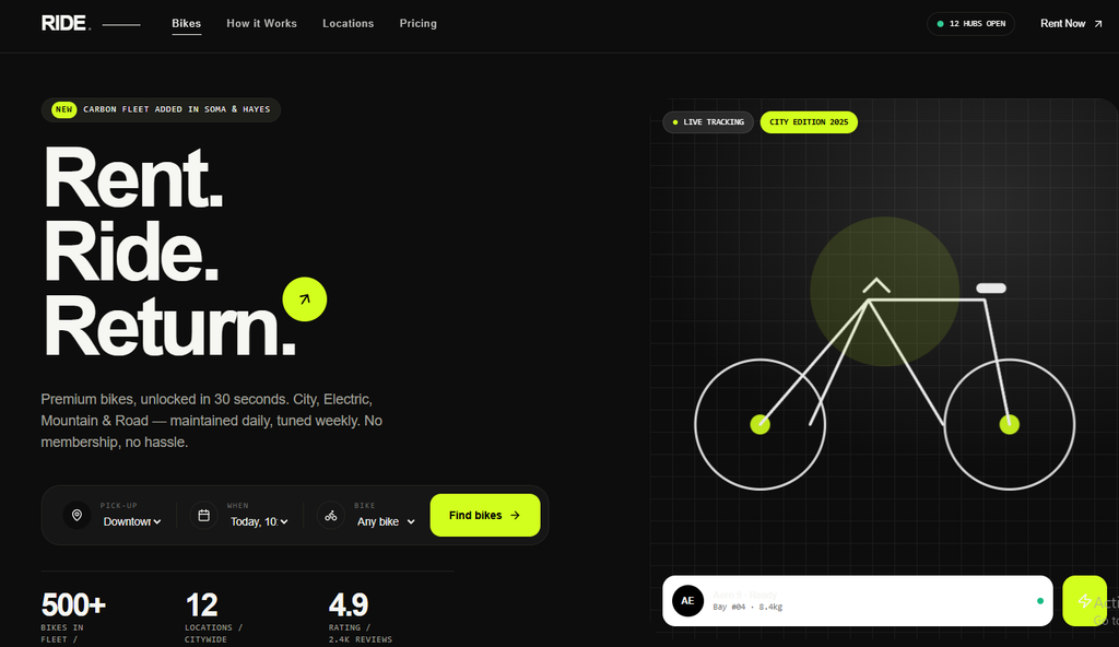
In a market flooded with cluttered booking experiences and forgettable rental sites, RIDE stands out. This is a modern bike rental template designed from the ground up for performance, aesthetics, and usability. Dark hero section, sharp lime accents, Swiss-style typography, and fully interactive components—filters, booking bar, transparent pricing, and a clean FAQ—make it feel premium without ever feeling complicated.
Designed for Impact: Dark Hero + Lime Accent
RIDE opens with a dramatic dark hero. High-contrast imagery of bikes against deep blacks and charcoals creates immediate atmosphere. A vibrant lime green accent cuts through the darkness—used sparingly on CTAs, hover states, selected filters, and key interactive elements. The result is energetic, contemporary, and impossible to ignore. The lime doesn’t compete with the bikes; it highlights the action.
Swiss-Style Typography That Commands Attention
Clean, geometric, highly legible type is the backbone of RIDE. Inspired by classic Swiss design principles, the typography prioritizes hierarchy, white space, and readability. Headlines are bold and confident. Body text stays precise and airy. Every section feels intentional. No decorative flourishes. Just clarity that builds trust—exactly what users need when they’re deciding to rent a bike.
Fully Interactive Experience
RIDE isn’t a static brochure. It’s a working product:
- Bike Filters
Users can instantly filter by type (city, mountain, e-bike, cargo), size, price range, availability, and features. Filters update results in real time with smooth transitions. No page reloads. No friction. - Smart Booking Bar
A persistent or contextual booking bar keeps the conversion path visible. Select dates, pick-up location, and preferred bike category without leaving the current view. It feels native and responsive on every device. - Transparent Pricing
Clear daily rates, optional add-ons (helmets, locks, child seats, insurance), and total cost updates live as users adjust their selections. No hidden fees. No surprises at checkout. Trust is built into the interface. - FAQ Section
A well-structured, searchable FAQ answers the questions renters actually ask: deposit policy, cancellation rules, helmet inclusion, group discounts, late returns, and more. Accordion-style for cleanliness, with the lime accent marking open states.
Who RIDE Is For
Whether you’re launching a local bike rental shop, scaling an urban mobility service, or building a multi-location fleet platform, RIDE gives you a polished, conversion-focused foundation. The design language works equally well for premium boutique rentals and high-volume city fleets.
Why It Converts
- Strong first impression with the dark hero
- Instant product discovery through powerful filters
- Frictionless booking flow
- Transparent pricing that reduces drop-off
- Professional Swiss aesthetic that signals reliability
- Hero with “Rent. Ride. Return.” + booking widget (location / date / bike type)
- Featured Bikes — filterable grid (All / City / Electric / Mountain / Road) with hover cards
- How it Works — 3-step dark section
- Experience banner + Locations
- Pricing — Hourly / Daily / Weekly
- Testimonials & FAQ
- Footer with newsletter